

When you have spent a lot of time picking the right brand color, you should also spend sufficient time picking the correct category of substrates that you want to print on. The appearance of substrates matters and will influence the perception of the brand color.
Please note that I used ‘substrates’, not just ‘papers’. And that’s on purpose: there are many more substrates than papers. E.g., flexible packaging, cardboard, labels, and even glass.
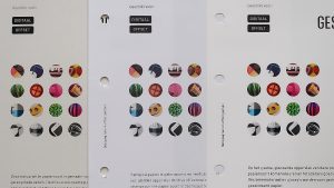
You probably know there is a difference between coated and uncoated papers, but there’s more than that. Take a look at the catalog from a paper distributor, there are a lot of different papers and cartons! And then there are all those other substrates… Below is only a small selection of papers, from the Print.com sample kit. And these are only coated papers.

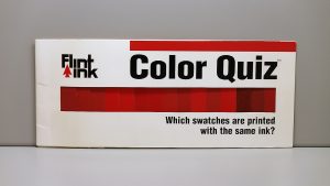
To show why this matters, take a look at the picture below. That’s the Flint Ink Color Quiz, a gimmick they used to hand out during trade shows. This clearly showed the effect of the substrate on color reproduction and color perception. Believe it or not, all the colors below are printed with the same ink… The variable is the paper it is printed on… Amazing, isn’t it?
The influence of the ‘color’ of the substrate is twofold: given that most inks (certainly standard process colors) are transparent, the background becomes part of the mix. Plus, the color of the background will influence color perception. When you go shopping, check out the Kellogg’s packages. These days, they also have a second prominent color, next to Kellogg’s red, depending on the product. Even when all those packages would have an identical Kellogg’s red (less than 1 dE00), they would not look the same. That second color influences the visual impression. And that’s similar to the color of the paper influencing your visual perception.
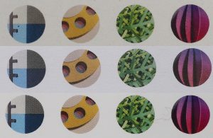
Look at the three papers below from the Print.com sample kit. One is coated, the second is uncoated, and the third is a special paper. And now, look at the third row, the first (blue) and third (green) from the left. Although this is the same image they printed, you will see that it’s slightly different if you look closely. That’s why you should take a look at the substrates and why you might want to specify which types of substrates are preferred, or forbidden.
Some substrates (mainly papers) also play tricks on us: they have hidden powers that are only revealed when ultraviolet (UV) light strikes the paper: they contain ‘optical brightening agents’ (OBA). These are a special kind of chemicals, which will transform UV light (which we can’t see), into light blue. This means that under fluorescent lights, these substrates will glow and appear very bright. In some regions, these OBAs are very popular, in other regions, they are not. So, you might want to specify whether this is allowed or not. As a side note, with the strong move towards LED lighting, it usually does not have UV in it, which makes the OBAs useless.
In summary, if you have a vibrant blue as your unique color, you probably don’t want yellowish paper to print it on… That’s why you should include directions regarding the papers, and more broadly: substrates, that are allowed, discouraged, or even forbidden. If you want to know more, ask advice your printing company for advice!
There are a lot more factors that might influence your brand color, check out the Project BBCG tutorial to find out more! And if English is not your native language, check out the available translations!
PS: the sample kit I received from Print.com, is an excellent sample kit! Every printing company should look at it, should learn from it. Here is more information!