

A print job isn’t over until it’s finished. You can apply all kinds of varnishes and laminates, special foils, and more. These can have a practical use, e.g., protection or a security feature, but usually it’s used for their visual properties. And that’s why you need to consider the finishing when you decide on print production. Especially if your brand color is precious.
To start with an anecdote from a long time ago: a book publisher specifically demanded that the book cover have a matte laminate, because he really liked the tactile aspect of that matte laminate. But when the books were delivered, he was very unhappy: the cover – which was a pure black – looked so dull! He wanted a very deep black!!! Well, those two are incompatible: a matte surface finish and deep, vibrant colors. It’s pure physics: a matte surface will scatter the rays of light and, therefore, look more dull. If you want to have deep, vibrant colors, you need a glossy finish.
Below are a two samples of the Print.com sample kit. The difference with the first two cards is only the finishing: a glossy versus a matte finish. But the images does not do justice to the effect in real life, you should check this out yourself! However, you can still see that the colors in the bottom sample are a bit more vibrant.
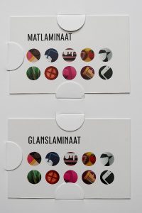
As a side note, please keep in mind that a matte finish is very vulnerable to scratches…
The advantages of a glossy varnish really stand out when you apply a ‘spot varnish’. This is where the varnish will be applied to only a part of the print job. That way, those parts will stand out. If that’s, e.g., your logo, it will look very vibrant.
With spot varnishes, you can also apply special effects, e.g., by playing with the amount of varnish, the thickness, or by applying a structure to it. You can have nice tactile effects with that.
Here is a very special one: ‘edge painting’ or ‘gilding’ (when you translate the Dutch term for it, ‘kleur op snede’, you will get ‘color on cut’). This is where the edge of the (thick) paper is painted. This is used mainly for high-end business cards, but I seem to remember that I have already seen this with hard-cover books. And talking about books: the complete side – so: all pages – can be painted or gilded this way, e.g., with gold.
The sample set from Print.com has two examples: one with gold metallic, the other with ‘neon’, a fluorescent pink. Now, look at the image below. Do you think the paper they used is the same – except for the edge painting? That the prints look the same? My brain says these are different, but guess what my much more objective friend Nix Spectro 2 says about the difference between the two papers…
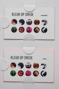
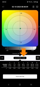
Well, it looks that the spectrophotometer doesn’t agree with my brain: there is no difference between the paper types… A 0,12 dE00 difference is invisible, a 1 dE00 is considered as the lowest visible difference. And not even everybody can see a 1 dE00 difference.
So, you need to check this upfront! Your print provider will certainly help you evaluate the choices you have. Just ask!