

It might seem a bit strange if you are unaware of it, but the light source will influence how a color appears. It is an essential part of what ‘color’ is. In case you didn’t know: color is the interaction between a light source, an object, and an observer. And if one of these variables changes, the ‘color’ might be different.
So, let’s look at the light sources. To mention two extremes: a candle will show warmer light (more red) than the sun at high noon in Summer time at the equator (more blue). That property of a light source can be expressed as the light ‘temperature’, which is one number, e.g., 5000 Kelvin. That 5000 Kelvin happens to be the color temperature of the standard light source used in the printing industry: D50. And that D stands for ‘daylight’.
Now, be careful! ‘Daylight’ in real life can be very different: the color of the sunlight that reaches you depends on the path it takes through the atmosphere. If it’s a short path (e.g., noon in Summer time), it will look bluer than when it’s a long path (e.g., in Winter in a Nordic country). The color depends on: the time of the day (morning vs noon vs sunset), the day of the year (Summer vs Winter), the location on the earth (equator vs Nordic countries), and also on how cloudy a day is. That’s why clever people have created a standard for what ‘daylight’ looks like. And they didn’t create one ‘daylight’, they created multiple daylights… The ones that are probably relevant for you are: D50, the standard light source for the printing industry, and D65 (6500 Kelvin, a bit more blueish), the standard light source for more or less all other industries, e.g. paints.
Maybe you have never noticed this difference, that’s because our brain does a clever trick: it has some kind of ‘white balance’, just like your camera has. So our brain always says that the light you see is ‘white’. Unless you look very closely, very attentive.
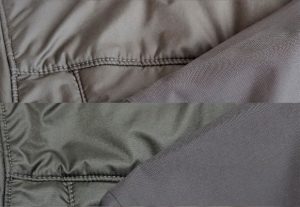
But there is something nasty about those different light sources: it can happen that two colors look the same under one light source, but different under another light source… Take a look at the image below, which shows two pictures of two different fabrics, the inner and outer shell of my winter jacket… Under one light source, they look very close in color (the top part of the image). Unter another (the bottom part of the image), that one brown turns a bit green…
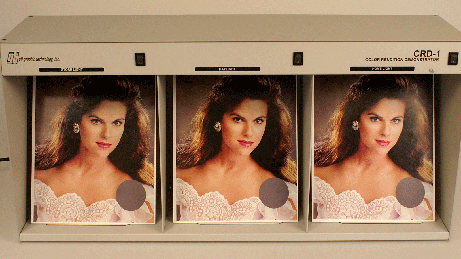
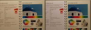
In the printing industry, everything is geared towards D50. This means that if you compare a proof with an actual print job under a D50 light source, they will look the same. But if you compare them under another light source (e.g., at your office or home), they might look different… That’s not the printer’s fault! That’s why you should only evaluate color under D50. And there’s a clever trick to know if the light you are using conforms to that D50: a metamerism test kit, like the one from UGRA below. Which will show only one color when it’s D50, but different color blocks when the light source is not D50.

This is valid for visual color comparison and for color measurements: you need to use the (right) light source, also for measurements! To show you the impact, let’s do a small experiment: I measured a few colors with my Nix Spectro 2 and did this twice: one time with the light source set to D50, the second time with D65 as the light source. Let’s check how these measurements compare!
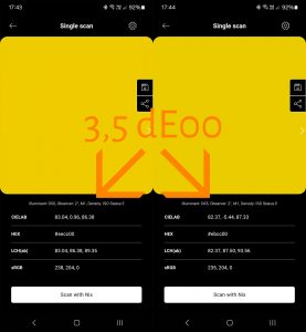
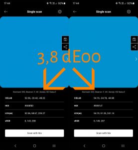
As you can see, with only the light source in the spectrophotometer changed, you do get different readings. The color difference between the two measurements for Yellow is 3,5 dE00, for Cyan it’s even a tiny bit higher: 3,8 dE00. That’s why you need to make sure you use the correct settings and include those in the brand color specification!
The only way to make sure a proof and a print look exactly the same under all light sources, is if they are made with exactly the same materials. It’s not the fault of the printer when they look different under another light source than D50, it’s physics.
Take a look at the image below. This is from a catalog with all kinds of proofing papers. The left part is a picture taken with D50 as a light source, the paper of the left and right page look identical. And that’s of course the idea when you use proofing paper: it should look identical to the real stuff you are going to print on. Now let’s add just one little thing to the light: some UV… That’s the right part of the image below. Just look how different the two papers are now! The reason: the left one contains Optical Brightening Agents (OBA, which is an essential part when choosing a substrate, as dicussed in the previous blog post).
Next to color temperature, another important variable is the amount of light. If you have ever visited the press room, you may have noticed that the control station next to the printing press has a lot of light! Wow! You almost need to wear shades! (please don’t: these might be colored… 😉 ). There is a good reason for that: with more light, you can better spot color differences. But we need to be realistic about that: tiny color differences you can see with that amount of light, will probably not be visible with a more normal amount of light, e.g., in a shop. That’s why the applicable ISO standard (ISO 3664:2009) makes a distinction between a ‘critical comparison’ (the one next to the printing press, with a lot of light) and the ‘practical appraisal’ (which has a more ‘normal’ amount of light). And that last one is what you need to evaluate a print job.
And with this, I hope you really saw the light. Thanks for reading!
There are a lot more factors that might influence your brand color, check out the Project BBCG tutorial to find out more! And if English is not your native language, check out the available translations!