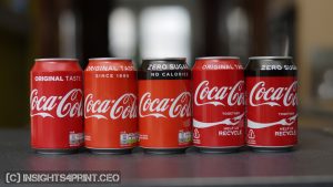
Brand colors are precious to their owners, Coca-Cola even called Coca-Cola red their ‘second secret formula’ (check this archived page).
Brand owners, prepress houses, and printers spend a lot of time getting that brand color ‘right’, including press checks. Which are, BTW, very expensive and probably unnecessary.
Over the past few decades, technology has improved significantly. These days, you can even get very nice quality in flexo printing (the technology used to print plastic bags, e.g.). And the tools are there to measure, to control that quality.
However…
There are still many discussions about the reproduction of brand colors. Sometimes, jobs are even rejected and reprints demanded, while nothing is wrong with it. One important cause for these discussions: flawed brand color guides.
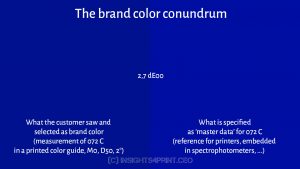
Over the past few years, several variables have become very clear. The most important one: deviations in the #1 tool brand owners and designers use, the printed Pantone color guides. Many, if not most, creatives think their copy of the Pantone color guide is an absolute reference. It is not. It is a printed representation of the ideal ‘master’ color. And as with all prints: these have tolerances. Pantone claims that about 90% of its colors are within a 2 dE00 tolerance, so 10% is outside the 2 dE00 tolerance. Which ones? I don’t know… Do you? But if you pick one of those colors that are outside 2 dE00 as brand color and print jobs look different, don’t blame your printer! It’s your copy of the color guide that is wrong. BTW: your printer is probably checking colors with the Pantone ‘master’ database.
Also, a few practical tests showed higher-than-expected deviations. Here is more on that. This brings us to the main point of Project BBCG: measure the color you picked and use those values as your primary color definition. This is the only rock-solid way. And with measurement devices (spectrophotometers) being widely available, the time is now to implement this approach to brand color definitions!
Check out the tutorial: ‘How to build a Better Brand Color Guide’! And do share it! We need you to help the world implement better brand color guides and prevent unnecessary waste.
BTW: keeping your brand color secret, as Coca-Cola says, is not a good idea: this will only result in more variations. The only way to get your brand color consistently reproduced is by publishing the brand color guide, and by making the color accessible for everyone as ASE files!