
Several experts provided input of Project BBCG. Here’s what they have to say. And below (click here) are the feedback from people that read the tutorial.
Kai Lankinen, founder of Dr. Lankinen Graphic Innovations, has over 20 years of experience in packaging printing and collaboration with international brand owners and printers: ”I’ve been following Eddy’s blog for a long time and found these posts very actual, entertaining, and educational. Having previously faced the same issues with brand owners’ color definitions, I noticed Eddy’s post on brand color guide and our discussion started a few months ago with a small note that a ‘Lab’ can be interpreted in several ways… And I’m pleased to see that Eddy has once again delved deeply into the topic and compiled the scattered professional information into a simple, but very describing and fundamental tutorial. I’m sure this will be very actual, entertaining and educational for everyone! – Thanks for your great commitment, Eddy!”
Henk W. Gianotten, long-time expert in font technology, typography, prepress and printing and author of hundreds of publications (view his online biography): “This publication is extremely important for brand owners, creators of corporate design, packaging designers and printers. Get rid of the Pantone suggestions for CMYK percentages and use the ASE- and/or the CxF-technologies to define the proper colors. Predictable, stable in production and reliable for additional runs. Nice work, Eddy!”
Paul Sherfield, long-time print standardisation consultant (The Missing Horse Consultancy) and FESPA Colour Management Ambassador: “In my many years of hands-on experience, I’ve seen too many brand and corporate identity manuals, both from national and internationally well know names, that are imprecise and therefore inaccurate when specifying brand and corporate colour for use in the many different medias available. CMYK and RGB values, e.g., are often quoted with no reference to an ICC profile or use case. Resulting in a brand colour that will look different for every combination of printing process and substrate used. Project BBCG aimed in clear terms to improve the reproduction of brand and corporate colours and the way they are specified to the many types and media, and communicated to all involved in accurate colour reproduction, including designers.”
Hauke Liefferink, managing director of ACME Graphics: “The Better Brand Color Guide is a great tutorial for brands to choose, define and communicate existing brand colors as well as introduce new colors that are entirely unique and not found in swatch books. Eddy does wonderful work describing a straightforward and practical way to do this across both printed and digital media. The next ‘color of the year’ is your very own color!”
Gary Courtney, Technical GC and Training at DagwoodLinnetts experiences the issues with current brand color guides on a daily basis. “We at Dagwood Linnetts specialise in quality print, mock ups and prototypes for the advertising, design and packaging industries. Project BBCG brings together important technologies and best practices which we have advocated for years, along with some additional rock solid approaches to brand colour standards all in one clever package. It’s a wonder that no one has suggested such an efficient approach years ago.”
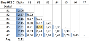
Gary, BTW, always has no less than 10 current copies of Pantone color guides in the shop. He was so kind to measure a few patches in these guides. The table below shows the measurements the Blue 072 C patch in 7 of his guides, and how these compare to the Pantone ‘master’ data. All were outside the 2 dE00 that Pantone specifies as the maximum tolerance, for about 90% of the colors.
Eddy Hagen, independent mind at insights4print.ceo and initiator of Project BBCG: “Too many discussions and too many rejected/wasted print jobs have the same root cause: flawed, ambiguous or incomplete brand color guides. It’s high time we approach brand color definitions in a better, a rock-solid way and share these in the easiest way possible: as ASE files. It’s high time for Project BBCG.”
Both on LinkedIn and via e-mail, a lot of people gave feedback. And this was mainly very positive. Here’s a selection:
- Andrew: “Very, very cool. And very timely as well. Highly recommended!”
- Constantin: “A nice project with a huge potential.”
- Jeroen: “Very interesting! Great piece of work. Kudos for all of you who worked on this project.”
- John: “There is a Silver lining. With a little education, some tools and a little effort this could lead to a better understanding of brand colors and a higher degree of customer satisfaction.”
- Anonymous: “Awesome content. Thanks for sharing!
- Lukas: “Thanks. And let’s do it right rather than patch with free alternatives.”
- Manuel: “A Must Read!”
- Mary (trainer): “I think this is an imperative initiative and long over due.”
- Javier (designer from Brazil): It’s a wonderful project, I really like the book, very simple to read and understand. “
- Stuart (printer): “A big cause of frustration as print seems to be forgotten about by fresh out of education designers. With no knowledge of colour. So a valuable piece of work.”
- Kevin (designer): “Love the idea, sick of the Pantone monopoly. (…) This helps.”
- Kleiber (trainer): “Excellent project!! The tutorial is clear and easy to understand. Thanks a lot! Congrats!!”
- Sherry (printer): “I think this project is wonderful!”
- Brett (agency): “Still learning… but I like the idea so far!”
- Steve (trainer): “Great initiative! It’s a relief that you’re making clear that RGB and CMYK values don’t mean much without a profile reference.”
- Jeff (designer): “Great concept”
- Colin (printer): “Seems to make sense.”
- Phil (trainer): “I’m a colour practitioner and your project key points all resonate with me. I’m constantly trying to educate my clients in better colour management and use of spot or brand colours in design. We need to do better as a design and print community. (…)”
- Robert (designer): “Brilliant idea. Good luck!”
- Tom (printer): “Wonderful! I’ve been saying this for years… MEASURE, MEASURE, MEASURE!!!!!”
- Giovanni: “The BBCG Project is very useful to avoid confusion. THANK YOU“
- Mike (supplier): “I love the approach of measuring the color you want, and then using that Lab/Lch value as the basis of the color you want. (…) Great tutorial; well done!”
- Rachel (designer): “Sounds interesting. I’m certainly not enjoying Pantone Connect!”
- Heleen (trainer/educator): “Love it! Still learning, but getting there. A million thanks for all the free resources and in-depth explanations. We can now all do better 😎👏”
- Christine (agency): “This is the first I’ve heard of it but sounds like such a great initiative.”
- Marco (trainer): “Great Job !”
- Mark (vendor): “It’s very interesting, on a number of levels.”
- Marco (on LinkedIn): “It’s time to stop with this ridicolous Pantone religion and start working with objective colour measurement.
Project BBCG changed radically my work : now i don’t start talking with a customer about a colour without an accurate measurement with my spectrophotometer.” - Alan (designer, on LinkedIn): “Highly recommended for anyone in the design business”
And what do AI chatbots say about Project BBCG?
Google Bard: “I think Project BBCG – A Better Brand Color Guide is a great resource for describing brand colors. It provides a comprehensive and systematic approach to defining and communicating brand colors. The guide covers all important aspects of brand color, including:
- The different ways to measure and describe colors
- The factors that can affect the appearance of colors
- How to create a consistent and accurate brand color guide
- How to share brand color guides with others
I particularly like the way that Project BBCG focuses on the practical application of color theory. The guide provides clear and concise instructions on how to create and use a brand color guide. It also includes a number of helpful resources, such as templates and sample color guides.
Overall, I think Project BBCG is a valuable resource for anyone who wants to create and use accurate and consistent brand color guides. It is a comprehensive and practical guide that iseasy to understand and use.”
And after some discussion with the AI chatbot of Microsoft Bing concluded: “(“…) For these reasons,I believe that Project BBCG color are a better way to describe brand colors than Pantone colors.“