

When you plan a trip from A to B, e.g., Antwerp to Bruges, online route planners will offer you multiple options. And that’s the same with converting a color, e.g., your precious brand color, from RGB or Lab to CMYK. There is not one CMYK combination for a specific color in RGB, there are multiple. The reason is that you can mix ‘grey’ in two ways in CMYK, plus the combination of both. The first – and easiest – is only to use the Black channel (K). But you can also mix that grey when using the three other channels together: Cyan, Magenta and Yellow (CMY), in more or less equal quantities. And, of course, you can also opt for a mix of both options.
This might sound abstract, so let’s make it very concrete. Let’s take one of the insights4print.ceo and Project BBCG brand colors: a dark grey. In sRGB, that is 40 / 40 / 40. When I convert this with the ICC profile ‘PSO coated v3’, I get 66 / 57 / 46 / 75, a mix of all colors. But I’m not too fond of that combination, for practical reasons: print stability. Since it is pure grey, I would like to have it printed only with Black ink! When testing a few combinations in Adobe Photoshop, I found that 0 / 0 / 0 / 95 is virtually identical to that complex one. But on press, you only need to control one color instead of four, which makes it much more stable in print.
If I would have used another ICC profile, I would have gotten a different combination in CMYK. For example, with ‘ISO coated v2’, that would be 73 / 62 / 63 / 72. If you like, you can test this yourself: from the ICC website you can download many free ICC profiles. Pick different ones for the same ‘characterization data reference’ and check the conversions.
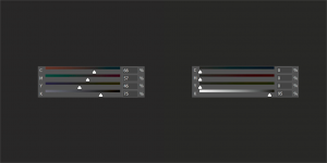
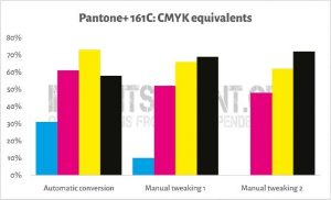
Now, this does not only apply to grey colors, also for chromatic colors, you can have different mixes in CMYK. In the Project BBCG tutorial, you can see how Pantone 161C is converted. With the PSO coated v3 profile, this will be converted to 31 / 61 / 73 / 58. So, let’s play a little bit in Adobe Photoshop. Let’s bring CMY a bit down and move K a bit up. When I get to 10 / 52 / 66 / 69, I get virtually the same color. I can’t see a difference on my calibrated screen. But we can even go further: bring CMY even more down until one of them is at zero: 0 / 48 / 62 / 72. This not only uses less ink, but it will also be more stable in print.

This trick, to bring CMY down up to the point where one of them disappears, is nothing new. This is an age-old trick used in packaging, especially in flexo packaging printing. Why? Because a few decades ago, flexo printing was notoriously bad when it came to small printed dots. With conventional plate making, low percentages were impossible. Plus, the stability of flexo presses wasn’t optimal.
To keep printed colors within acceptable tolerances, prepress houses opted to adjust printed brand colors and eliminate low percentages by adjusting the other colors in that specific combination. And yes, the brand colors in print could look slightly different, but customers didn’t complain. It didn’t affect sales (even though some people might want to convince you that the slightest color deviation impacts sales, there is no proof for that claim; it didn’t happen in the past when flexo packaging had relatively high tolerances, why would it happen now?). The adagio of prepress houses and flexo printers in those days: the fewer colors in a conversion, the better.
A lot has changed since the introduction of digital and HD flexo plates, but that old wisdom is still valuable. That’s why it is part of the Project BBCG principles. That’s why we encourage you to check different combinations for your brand colors in CMYK, even if there is a slight theoretical difference. When using a conversion that includes all colors, that might become something quite different in print: better safe than sorry.
PS: yes, I did leave out the influence of different settings in the software that will do the conversion. That was on purpose.