
Here’s something many people seem to forget when it comes to the reproduction of colors on screens (like TV sets and smartphones) and monitors: you control the input, but you have no control over the output… This means that the reproduction of your brand color on a specific screen can be quite different from what you had in mind. Even if you have done everything by the rules and perfectly specified the RGB data (including which RGB profile used).
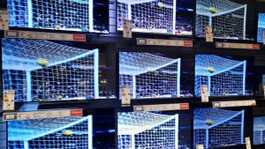
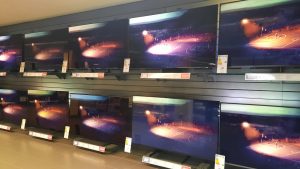
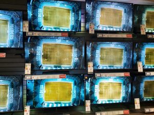
Did you visit a store that sells TV sets recently? You should. And you should critically look at how the different TV sets reproduce the colors of the images shown. Usually, these shops show the same video on all TV sets, so you can easily compare the quality. And it is in such an environment that the challenges of reproduction on screens and monitors become clear: they all have the same input, the same RGB data, but the output will differ. Sometimes even significantly. E.g. look at the top image: check the blues, check the colors in the banner at the bottom… All TV sets got the same input… Or the image below, check the color of the grass.
Why is that?
There are several reasons why screens show different colors even though they get the same input, but let’s check the two most basic ones: the capabilities of the screen and calibration (or better, the lack thereof).
The capabilities of a screen or a monitor depend, e.g., on the technology used. OLED is becoming very popular today, e.g., for smartphones, while LCD technology was king a few years ago. And OLED is known for its much more vibrant colors and deeper blacks. But even with LCD screens, there could be differences, depending on the quality and cost.
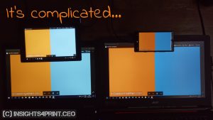
Below is a comparison from a few years ago, showing four screens with the same input. It looks quite different, isn’t it?
And even if your monitor has a ‘gamut’ capable of reproducing all the colors you can encode in AdobeRGB or DCI-P3, you must be sure that it does that correctly. That’s why monitors need to be calibrated, and that this should be checked frequently. In the old days, when we still had CRT monitors (those thick, heavy boxes), this should be done every few weeks because the colors could shift…

As a sidenote: on insights4print.ceo, there is a color quiz, a test with six variations of ‘Coca-Cola red’. No less than 78% of the people from the printing industry that participated in this test, did this on a monitor that was NOT calibrated… And you might want to check the results of that test (spoiler alert: the most popular choice was NOT the right one…)
There are also other factors influencing the reproduction and perception of colors on a monitor. There are even ISO standards stating how to evaluate colors on a monitor! These are two important ones:
- ISO 3664:2009 – Graphic technology and photography — Viewing conditions (basic information, the standard itself)
- ISO 12646:2015 – Graphic technology – Displays for colour proofing – Characteristics (the standard)
An important one is e.g. the placement of the monitor: it should not be near a window, where the sunlight can influence the viewing/perception. Nor surrounded by colored walls. For accurate color viewing, there are important rules that apply!
To conclude, there is much more to reproducing your brand colors on a monitor than you might think… And, rest assured: you will NEVER have complete control over what your brand color will look like on every single screen… Be it a smartphone, a laptop, an office monitor, a TV set at home, a cinema, or outdoor advertising.
But, don’t worry: our brain is something special… It is not a spectrophotometer, it will interpret the color information it gets from the retina and will automatically do some corrections (like the white balance in cameras, but even more than just that). If it sees the shape of the Coca-Cola logo and it’s a vibrant red, your brain will identify it as Coca-Cola, even if a spectrophotometer would call it a fail.
If you want to know more about the reproduction of colors on a screen, please check this article on insights4print.ceo: “That color was different on MY screen!”
And there are a lot more factors that might influence your brand color, check out the Project BBCG tutorial to find out more! And if English is not your native language, check out the available translations!
PS: dear designers, please check your designs on a large gamut monitor (AdobeRGB or DCI-P3) to see how it looks. Some designs, e.g., with a vibrant magenta (like 255 / 0 / 255 in AdobeRGB), hurt my eyes. Really.
PPS: here are two more pictures from my brief trip to the electro shop, showing the different output on different screens, different types of screens (it was a mix of OLED and LCD).